Influences
After deciding our movie storyline we went onto to doing some researching a typical mafia/gangster movie posters, to get more of an idea of what kind of movie poster we wanted to do. We wanted to centre our movie poster, our the main character and genre. Below are some of our influences.

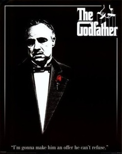
This poster shows that the character don is superior because he is in the middle of the poster. Also the outfit that Don is wearing is very elegant and the only thing in color is the rose. The red represents royalty but it also symbolizes blood, showing that this film is filled with death and tragedy.
This poster unlike the godfather has more a photographic look to the characters then a artistic drawing look like 'The Godfather' character. This is less of a teaser trailer because it has more information on it like the credits and the main actors.
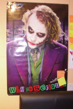
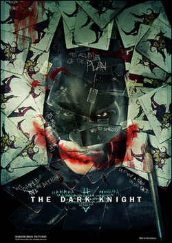
Even though these posters were created almost 50 years apart, both have very similar styles, which are the bold black and white colors making the subject of the poster very suspicious and chose that the film is filled with a contrast between the good and the bad. Also both posters focus on the main characters of the film which creates a very serious aspects showing us that the genre is thriller as well as action.
Practising on Photoshop - I took a photograph of each of our characters and looked at how we can edit them to create a similar style.


Below are the screenshots of how we used photoshop to create a similar effect to 'The Godfather' and 'American Gangster'.
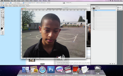
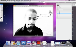
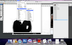
First we inserted the image into photoshop
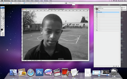
Then we adjusted the photograph by desaturating the image to make it black and white.
> IMAGE > ADJUSTMENT > DESATURATE
> IMAGE > ADJUSTMENT > DESATURATE
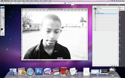
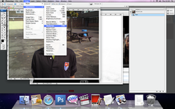
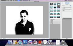
Then we increased the brightness by almost 75% and then increased a bit so you could still see the shadow on one side of his face.
> IMAGE > ADJUSTMENT > BRIGHTNESS/CONTRAST > Increase the levels.
> IMAGE > ADJUSTMENT > BRIGHTNESS/CONTRAST > Increase the levels.

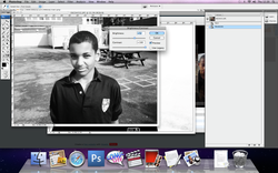
After saving the brightness adjustments. we re-opened the newly set levels and readjust them so the contrast was increased more than the brightness.
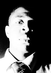
After saving the new brightness and contrast's levels, we opened it up again and readjusted the levels but this time w increased the contrast a lot more so the shadow on one side of his face was darker creating a film noir lighting which shows the character's personality of good and bad.

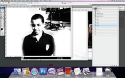
Using the eraser tool, we erased any unwanted background, leaving the background plain.
We then destaturated the image, creating it more like the black and white posters that we researched.
After desaturating the image, we increase the brightness and contrast. We then re-opened the levels of brightness and contrast and increase the contrast again. We did this three times. In order to get rid of the different shades on the child's face, simplifying the photo.
We then erased the background so it was plain. It way we could place two photographs together.
we finish it off and give it more of an artistic effect, we clicked on filters > artistics (effect) > dry brush
We adjusted the effects so the brush stroke were a size 8, so it was big enough to tell we added an artistic effect.

Working On Dre Monte
This is the artistic effect we created using the photograph of Joseph, but this time I used an effect called 'Curves' which is a chart that shows the different peaks of dark and light shading you can move the line around to play around with how strong the white and black shadings are.
I like the photograph of the younger boy more because it has less shading, and the bold black and white looks stronger, which fits the genre of action, and gangster theme.
Layout of a teaser poster
Once we had decided to stick with the black and white style, then we started looking at how we could layout our teaser poster. We looked at a variety of posters.
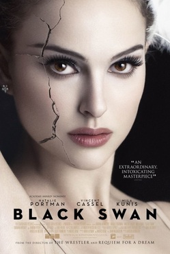
The main image, with the crack over it represents her life breaking apart. The main character's image is the primary object showing that Natalie Portman is the main character and she is the most important character because the movie is based on her and her life falling apart

The plain background keeps our attention on everything in the middleground and foreground. The make-up and tiara gives away a bit about the character's role. She's a performer, actress, etc;
Featuring that they won a award at the Venice and Toronto film festival shows that the film is worth while wathching.
Featuring that they won a award at the Venice and Toronto film festival shows that the film is worth while wathching.
We want our poster to be completely dominate of the main character, to let the audience know that this film is about their life and the journey they are taking in that film. Also we wanted it to be a simple layout.
1) PHOTOGRAPH - main character
2) TITLE - strong and bold, stands out from the other font.
3) QUOTE/ CREDITS, ETC;
We looked at laying the photograph like a list of items one after the other , so the viewer looks at everything in a certain order.
1) PHOTOGRAPH - main character
2) TITLE - strong and bold, stands out from the other font.
3) QUOTE/ CREDITS, ETC;
We looked at laying the photograph like a list of items one after the other , so the viewer looks at everything in a certain order.
Here is an example where the evil is seen on the front cover but is still an important character that is why he is on the poster. This poster also has the tag-line of the movie on it so when someone reads it out they will remember it and will be waiting to here it in the film.
Again, a similar layout - Main character, title and production company in small prints at the bottom of the page.
This is one of our main influences of a teaser poster because it straight-forward and has very little information. Also a teaser trailer fits better with a teaser poster.
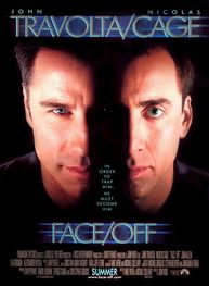
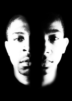
We like the format of the 'Face-Off' because this way we could show the resemblance between the 'Dre Monte' and 'Marcus
Creating the Film Poster
We took our primary photographs of the main character which was a convention we picked up from the posters we researched.
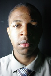
Photographs I took of Curtis who plays the character, Marcus Goddard
Creating the Film Poster
We took our primary photographs of the main character which was a convention we picked up from the posters we researched.
Photographs I took of Curtis who plays the character, Marcus Goddard


Photographs I took of Joseph Mdala who plays, Dre Monte Goddard.


I chose these photograph because the lighting is very similar making it easier for me to edit the faces together. Also there facial expressions are similar. This helps the viewers to than concerntrate more about their facial features and less about their expressions. I told curtis to wear a black top because it would blend into the background (didn't blend clearly) so all I had to do was used the magic tool in photoshop and delete all the selected black instead of using the eraser tool which is more time consume. We also like the lighting because it shows a contrast of how good and evil is in both of them but one is consumed more by evil than good, and the other is good and is being swallowed by the darkness.
Edited the main photograph
These are how the photographs looked after adding the effects.
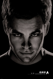
Using photoshop I first desaturated the image like I did in the practise run. And I also increased the contrast and brightness like the practise. But instead of increasing the levels of brightness and contrast three times, I only did it twice because the actors looked very strong with a high quality photographic look than an artistic effect like typical gangster film posters. Also using a photographic look meant that the you could see more detail. With this detail showing the character's looked related. Also after we erased unneccessary background, we kept it black like the 'Star Trek' poster and 'The Godfather' background because the darkness emphasises the mystery and the idea of it being a teaser poster.
Using photoshop I first desaturated the image like I did in the practise run. And I also increased the contrast and brightness like the practise. But instead of increasing the levels of brightness and contrast three times, I only did it twice because the actors looked very strong with a high quality photographic look than an artistic effect like typical gangster film posters. Also using a photographic look meant that the you could see more detail. With this detail showing the character's looked related. Also after we erased unneccessary background, we kept it black like the 'Star Trek' poster and 'The Godfather' background because the darkness emphasises the mystery and the idea of it being a teaser poster.
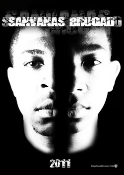
First Design
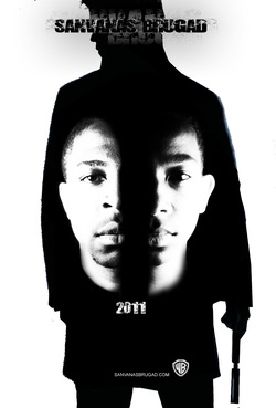
Second Design
REVIEWS ABOUT OUR POSTERS: 'It looks a little plain, the font isn't consistent with your magazine and teaser trailer. But I like the two main photograph because the effects you've used makes the two faces similar, which tells me they are some how related.' - Said by Rakhee Odedra, a media student from another school.
'I like the silhouette and how you laid it out so you could fit the two faces in the middle, but it isn't as mysterious as the second poster, which shows more of the genre, thriller. It shows more of the idea of conflict between the two characters.' - Said by Vicki Godhania, a under-graduate studying business management.
'I love the second design more than the first design because the simple layout makes the characters look strong and it makes you think more about the connection between the two characters. But the font is more urban than sleek which is what your poster looks like at the moment. ' - Nastja kasic, Media Student at Lampton School
After reading our review, we went back and changed the poster so it was more consistent with the teaser trailer.
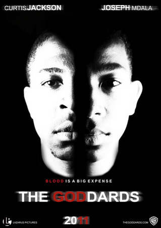
We preferred this poster because it fitted together with our teaser trailer and our colour scheme with the red and white title like we used in the trailer where we faded the title from white and red colour. It is also the same font, and looks less urban than the second designed poster. We received a lot more positive feedback
Rating the Poster (10 being the best)
1 out of 10 - 0 VOTES
2 out of 10 - 0 VOTES
3 out of 10 - 0 VOTES
4 out of 10 - 0 VOTES
5 out of 10 - 1 VOTE: Liela said ' I like the photographs but the poster was too plain and didn't make me want to watch the film but the photoshop work was good'.
6 out of 10 - 0 VOTES
7 out of 10 - 3 VOTES: For example, Liam Nelson, 'It is really well edited and has a great layout, showing effort but it doesn't look professional because there is too much black space, but I really did like the photographs, which look really powerful and dominate then me, whoever looks at the poster.
8 out of 10 - 7 VOTES
9 out of 10 - 9 VOTES
10 out of 10 - 1 VOTE - Michael Cooper, 'Looks awesome! It looks absolutely professional. I like the simple look because you have all the different element but you still worked on it to make it slightly different like the title which is just Arial but you added effect onto it to make it your own'.
